This is is way of researching or analysing an investment. You can use technical analysis to analyse the price of any asset – a stock (like Amazon, Microsoft, Apple), a crypto (like Bitcoin, Zilliqa, Ethereum), Gold, Silver, and the likes. What’s you’re doing is you’re seeing patterns on a chart – a chart made up of prices of that asset (crypto or stock or whatever) and you’re predicting the future.
So technical analysis built on three rules
- Price reflects everything. You don’t need to know what a crypto does or what a company does. The price tells you all and will reflect any development of the company.
- Prices move in trends. So there’s a pattern to moves on the charts
- History repeats itself. So future predictions of a price move can be made based on looking at the past.
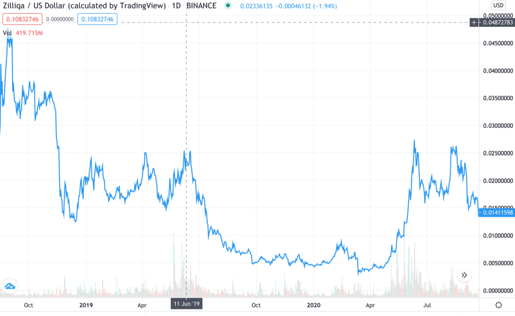
Let’s jump in and have a look at a chart. This is the chart for Zilliqa (a crytocurrency). So you see a few things here
- Most prominent is a BLUE LINE. This is the price of Zillqa plotted between somewhere around Oct 2019 and August 2020. That’s how the price moved. So if you strain your eyes a little, you will see the price of 1 Zilliqa was around 0.045 $ (or 4.5 cents) in October 2018 (the left hand side of the chart). Then as you move right, you see ups and downs, largely a down which touched somewhat of a low in April 2020. Then the price of 1 Zilliqa came down to less than 1 cent. So if you were unlucky enough to buy $45 worth of Zilliqa (1000 units of Zilliqa or 1000 Zilliqas) in October 2019, by April 2020 you investment would be worth $5. Bad, uh?
Now see the next part of this chart. Same chart of Zilliqa’s price but after April 2020
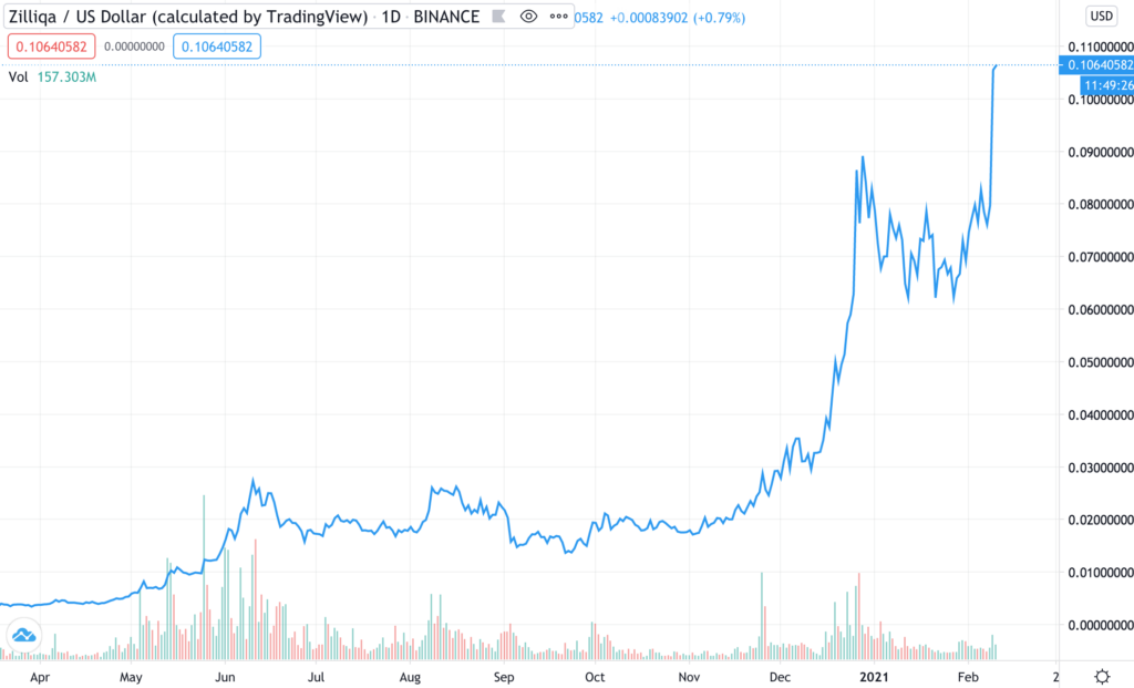
It started moving up, and it currently at a level of 11 cents. So you’re 1000 Zilliqa is worth $110.
One investment lesson here: PATIENCE PAYS. AND PATIENCE IS PROBABLY THE MOST DIFFICULT THING TO HAVE IN INVESTMENTS
Anyways, getting back. So that’s what a chart shows you. You see the movement of the price. Based on this movement, you can make predictions. Let’s have a look at the first chart of Zilliqa again. Only thing now, I’ve drawn a red horizontal line on it.
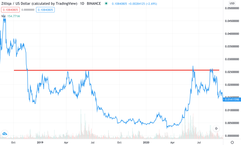
What you do in technicals is you draw lines, columns, tunnels, (there’s a science to it and we’ll see that later). You obviously can’t just go random and draw what ever you like and end up with a chart like this, and then wonder why your investment did not do well. If you do, it’s time to leave this blog and never return to investing again. Retire before its too late.
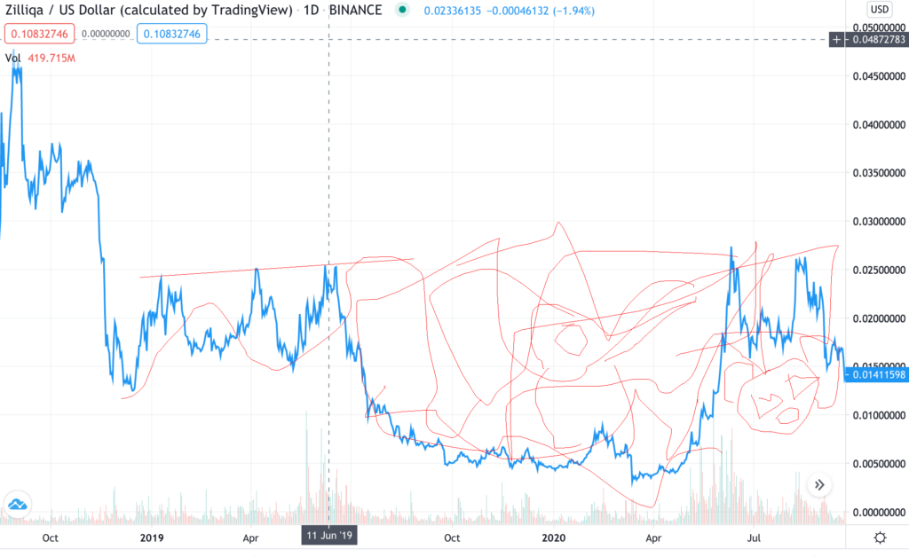
So coming back to the more saner chart of the two,

Let’s imagine we are at July 2019. I’ve drawn a red line touching the peak of almost three mountains there (up until July). So what I’m seeing is the price of Zilliqa has tried moving up but on at least three times, it’s more or less from the same level turned down. So there’s some kind of resistance there. So I extend that line to the future. Now move right along the price chart (assuming its real time and we are back in the past). So from April 2020, Zilliqa starts moving up. See where it goes and reverses from again. It’s hits the resistance line, falls…then moves up again, and hits that line again. So you see, based on the past, there’s a future predicted. (There’s no guarantee this happens always. Nothings guaranteed in investing). But you use indicators to try and predict the future. Let’s call this line a RESISTANCE LINE.
I guess that’s a lot in this post. But I hope you got something out of it. Feel free to drop in a comment. A lot more on technical analysis is coming

