So if you’re read some of my earlier posts on technical analysis, you’d know that the price of an asset (crypto, stock, gold, silver, etc.) can be plotted in different ways.
- A simple line chart which plots the closing price of each period (minute, hour, day, week, month…)
- A little more complicated chart, which plots the open, high, low and close of each period plotted. This is called a candlestick chart.
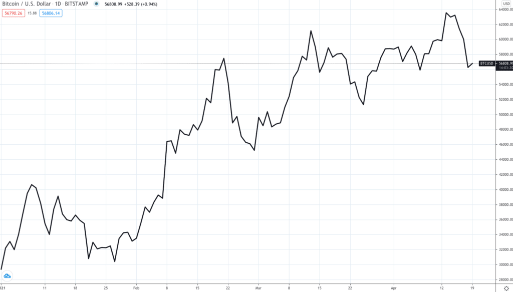
Here’s what the line chart for the price of Bitcoin since the beginning of the year looks like,
Here’s the same chart in a candlestick pattern,
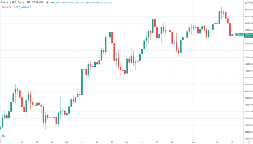
Focussing here on the second chart, what you see is
- Green and red lines. Let’s call these lines candlesticks
- Each candlestick consists of a thin line and a wider part. The line is called a shadow / wick and the wider part is called the body.
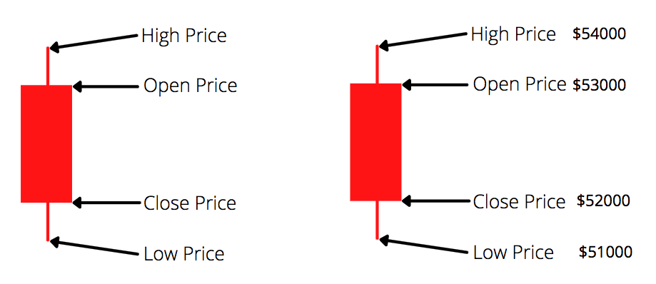
If I were to isolate a candlestick, this is what I’d see,

And this is what that means,
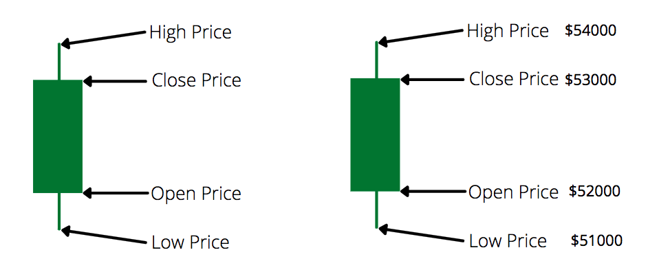
So on a day where Bitcoin closes higher than what it opened, you’d see a green candle (a positive day). It’s a red candle on a day when Bitcoin closes lower than what it opened (a negative day). Something like this,
It would help here to go back to a chart for a crypto of your choice on Trading View and have a look at their candlestick charts to get acquainted with this.
Observe how,
- Each candle may be different
- Some have bigger bodies, some small. A bigger body would mean a bigger price movement during the day (difference between the open and close price is high)
- Some bodies maybe in the center of the shadow line, some may be closer to the top (small upper shadow) and some closer to the bottom (small lower shadow)
- Some candles may have no shadow at all
In comparison to a line chart, a candlestick chart gives out a lot more data, providing a clearer idea of how the days trade looked like. Here’s a closer look at the candlestick chart for Bitcoin over the last few days,
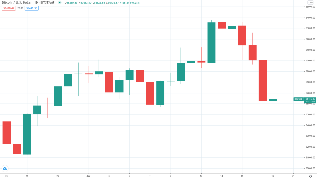
Let’s focus on that long red candle (2nd from the right), which plots the price of Bitcoin over the 18th of April. Here’s what the prices that day looked like,
Open: $60047
High: $60427
Low: $51544
Close: $56289
So you see a red candle because the closing was lower than the opening. You see a small upper shadow (on the top) compared to the lower shadow. What this signifies is,
- Sellers dominated during the session and drove prices lower
- However, buyers came in later to bid prices higher by the end of the session
- The strong close, far away from the low of the day, created a long lower shadow
Now you typically will see a group of candles to try and observe a pattern or a signal. Here are five important candlestick patterns you should know of,
The bearish engulfing
- Signifies an end of an intermediate uptrend
- A two-candle pattern, one green and one red
- The first green candle is basically engulfed by the second, red candle, which has a bigger body
- Signifies a tiring of a rally and resulting slowdown of price movement with a possible reversal
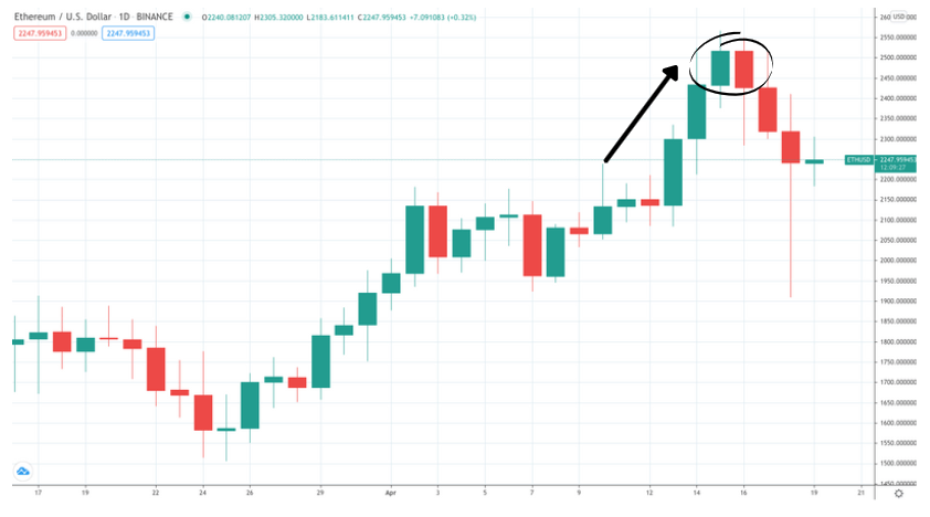
The bullish engulfing
Now that you know the previous one, this is pretty straighforward. Here’s a chart for ZIL (Zilliqa),
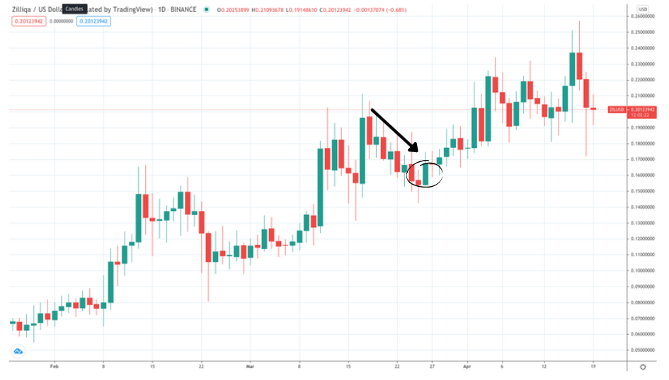
- Again, a two candle pattern, a red and green
- The first red candle is basically engulfed by the green candle which has a bigger body
- Signifies a tiring of a downward rally.
- Buyers come in strength which pushes up the price of the second candle, despite a lower opening price than the previous close.
The hanging man
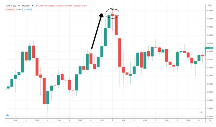
- A single candle pattern. If that chart looks a little difficult, this is what the candle ideally looks like

- Typically occurs after an upwards rally
- Had a body close to the top, with a small to no upper shadow
- Suggests there was a significant sell-off during the day. Compare it to the previous candles and you will notice that buyers / bulls are possibly losing control of the market.
Liking this content? Do not forget to subscribe to the monthly newsletter.
The hammer
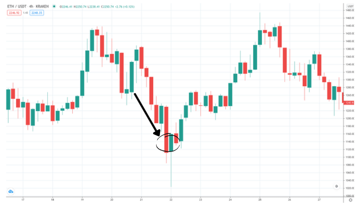
- Pretty much the inverse of the previous pattern, only this time occuring at the bottom of a downward trend
- The cande has a short body with a long lower shadow
- As you see, that candle has a long tail. So there was probably selling pressures during the day. However, strong buyers came in driving the price back up. Probably a telling sign that people now see value at this price and a reversal may well be possible.
The Doji
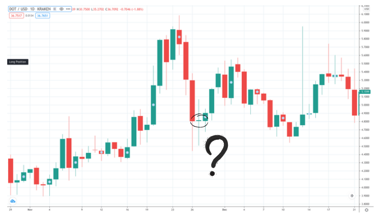
- This typically is suggestive of indecision
- Found at the top or bottom of a trend
- Since it shows indecision, it can signify a reversal or possible continuation of the trend (Sounds useless? Might not be if you spot this in a strong up or down trend)
- Think of it as a tiff between the buyers and sellers, each trying to drive the price in their favor.
In summary,
- There are scores of patterns in candlesticks
- Do not take any one as the final word or a definite science
- Technical analysis is meant to be a guide. So trade accordingly
- The more charts you start to look at, the better a hang of it you’ll develop
- Some patterns may work for you, some won’t. Just cause one doesn’t work, do not just dismiss the entire field
- As always do your own research, and keep learning.